We’ve been printing labels for the last decade and it’s given us a front row seat to common errors customers make on their custom labels. Despite all of the help pages with tips and guidelines these five mistakes are by far the ones we see most often. By sharing them one more time we hope to make you aware of what not to do when making a label design.
Number One: Don’t Upload a Low Resolution Image
The biggest mistake we see customers make is upload a file that’s low resolution. Low resolution, simply put, is a file that’s has so few dots per square inch it prints blurry or jagged. Whether it’s a photo, logo or clip art, the file has to be 300 pixels per inch resolution to print clearly. Many people copy and paste an image from a web page thinking that it looks good on the web page so it must look good on a label. Here’s the problem; web pages are only 72 pixels per inch resolution. That’s not very many pixels per square inch, especially when you consider the resolution of some of the new flat screen TVs out there.
Look at the two logos below. Both were copy and pasted from web pages, but look at the difference. The top logo is a very large image, 1233 x 600 pixels and will print nice and clear versus the bottom image, 280 x 280 pixels, which is a very small file.You can see what a difference a high resolution logo makes.
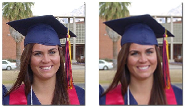
![]() The logos below were both the same size, but the one on the left is only 96 pixels per inch resolution. The logo on the right was recreated at 300 pixels per inch in a graphics program. The logo on the left doesn’t look terrible, but when you look closely the logo on the right is much sharper. Which label would you want to represent your company?
The logos below were both the same size, but the one on the left is only 96 pixels per inch resolution. The logo on the right was recreated at 300 pixels per inch in a graphics program. The logo on the left doesn’t look terrible, but when you look closely the logo on the right is much sharper. Which label would you want to represent your company?
![]()
Original Photos are Best
For photos, the file straight from the camera will have the best resolution. Don’t use thumbnails from any source. Thumbnails are very tiny files and will not print sharp. Files printed from thumbnails will make you feel like you’re looking through a camera lens that’s out of focus. If you’re uploading a very large photo and need assistance with cropping we’re happy to help.
Tips for Copy and Pasting Internet Images
Grabbing clip art, website logos, photos, or any image for that matter from the web is usually risky, so make sure you find the largest file you can of the image you want to upload. Copy and pasting from Bing Images or Google Images may not yield the best results.
There’s a way to sort image sizes when you search on the internet. For Bing the first choice above the images on the left is “Size”. From the drop down under “Size” the choices run as “All, Small, Medium, Large, and Wallpaper”. Usually “Large” will get you a fairly good sized file. In Google Images you’ll find “Size” under “Search Tools” on the far right above the image results. Google’s image sizes are listed as “Large, Medium, Icon, Larger than.., and Exactly”. Choose “Larger than… 1024 x 867” and the result should be a pretty good sized file with great print clarity.
Don’t Ignore the Warning Sign
Our design studio is pretty smart and does a fairly good job of detecting a low resolution image and will tag it with a warning symbol, a yellow triangle. If you see this warning sign, email us your image and ask us to check it for you to be sure.

Number Two: Don’t Super Size the Company Logo
This is a common mistake we see from DIY label makers who want to make a label for branding, either for water bottle labels or custom bottled water. They upload a logo and the user resizes the logo to fill the entire label from one end to the next. Yikes! Does Pepsi do that on a bottle? Does Dasani cover the entire water bottle with their name. Uhm…NO! And neither should you. By clicking on the corner of your logo and holding down your mouse you can drag and resize the image. You’ll want to figure that at least 1/3 of a water bottle label is visible when you look straight at the bottle. That’s the maximum amount of real estate your logo should take up on the label. Leave the rest of the label for important information like contact info, a photo or QR code. What you see on the screen is also your proof, unless you email us and ask for a proof after your order is in place.
![]() And getting back to resolution again…make sure your logo is high resolution too. Instead of copy and pasting it from your company’s website, which trust me, never works, get your hands on the file you use for printing ads, stationary or business cards. Those files will be 300 ppi. If the files are in a format you can’t open such as EPS, IND, AI or PSD, then email the file to us and our art department will convert it to the correct format for uploading and send it right back to you.
And getting back to resolution again…make sure your logo is high resolution too. Instead of copy and pasting it from your company’s website, which trust me, never works, get your hands on the file you use for printing ads, stationary or business cards. Those files will be 300 ppi. If the files are in a format you can’t open such as EPS, IND, AI or PSD, then email the file to us and our art department will convert it to the correct format for uploading and send it right back to you.
Number Three: Not Enough Color Contrast
Please, please, please do not use dark text on a dark background. The print result will be disappointing. Remember, you’re looking at a screen when you design the label and your screen is a bright light. Of course it will look brighter on the screen than when it’s printed. For example, while red and black are a great color combo, unless the red is a very vivid red it makes text hard to read. Same for deep purple, navy blue and black, the words you put on your label will disappear. Make sure when you use a dark background color you select a light color for your text.

Number Four: Don’t Ignore the Crop Line
In printing there is a crop line to allow for the bleed. The bleed is the area that gets trimmed off. In the design studio this is shown as red dashes or a solid red line around the edge of the template. This is the edge of a cliff you don’t want to step off for your design. Many times artwork comes through the queue and either a part of a word or a photo is right on the edge of the crop line. This means a letter or crucial part of an image gets shaved off when the labels are cut. Give the crop line a respectable berth when making your custom label. It looks more professional and saves you a lot of grief.

Number Five: Beware Very Small Text or Super Fine Fonts
If you choose a delicate font make sure the color contrast is sharp enough the font shows well. A very thin or fine font style can be tricky to use. The bolder the font the easier it is to read, obviously. Also make sure there isn’t a busy design or image behind the font that detracts from it. It might be that all you need to do is increase the point size of a thin font or move it, to give it more presence.
The same is true for using small text on your label. Since you can magnify the template in the design studio a small font will look deceivingly legible. Once it’s printed on the label to actual size that may not be the case. That doesn’t mean you need to use a 72 point font, but depending on the font style, anything below an 8 point font might be difficult to read.
Should you ever have questions about the images you’re uploading to make a label, email us your image as an attachment. We’ll look it over in a graphics program and make sure it will give you a superior print result.
Leave a Reply to Daphne Gilpin Cancel reply